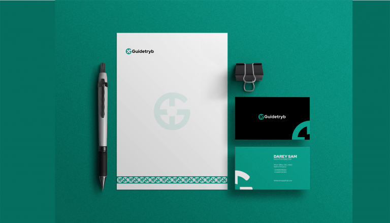
After so many deliberations in response to the “Understanding the Brand” questions. We have came up with this logo mark and type. We understand that the company is a mentorship company that wants to help others, young professionals and students. Following all of my research as the name implies “Guide” Tryb”. Guide is simply giving directions. so we related that with a compass. “A compass is a tool for determining cardinal directions.” with four major points. So therefore we curated the Logo mark from the combination of “G” which is the first letter in the brand name and “a compass”
“Moimoiseller is a local brand that specialize in sells of beans cake. “Moimoi” means beans cake in the native language yoruba. The Logo was borne out of 2 beans seeds inverted to form the letter “M”.
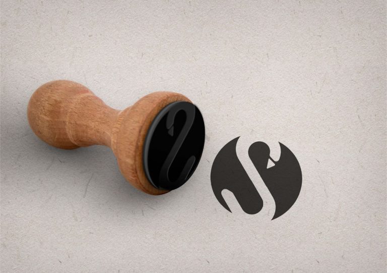
Se-vers Closet: A fashion Brand which majors in ready to wear clothings. The Logo icon was form the shape of a swan to trigger three major things: Self-love; Simplicity and Modernity. The Logo is also crafted to form the first letter in the Brand name.
Pasta Republic is a local cuisine thats sells pasta as his major recipe


